SAN MATEO COUNTY SUSTAINABILITY DEPARTMENT
SOLVING FOR TOMORROW.
The San Mateo County Sustainability Department is on a mission to drive sustainability forward through innovative programs and initiatives that meet both today's and tomorrow’s needs. From reducing waste and greenhouse gas emissions to championing sustainable housing and active transportation, they’re tackling the biggest challenges with a future-focused mindset. And they’re not just about policy—they’re bringing the community along for the ride with courses, volunteer opportunities, and youth programs to help build a climate-ready county.
In recent years, their work has expanded far beyond their original focus on recycling. Now they’re taking on energy, water, climate, and much more. To reflect this growth, they needed a fresh logo and identity that captures the full scope of their impact. That’s where we came in—partnering with them to give their brand a bold new look that sticks with you and amplifies their vital work in sustainability.
Logo.
The old logo just wasn’t up to the task anymore. It was too focused on recycling—a part of their story they’ve long outgrown. Our challenge was to evolve this into a sleek, digital-friendly icon that tells the full story of their current mission.
We started by simplifying and refining the existing mark into a clean, balanced symbol. Their fonts were swapped for modern, accessible typefaces that shine across all platforms. And we punched up the color palette to feel vibrant and fresh while still staying grounded. In the new icon, the color gradients symbolize an optimistic rising sun over the harmony of land, water, and air—a perfect representation of the holistic approach they take to the well-being of San Mateo County.
The updated logo sparked an exciting conversation: Should we update the name as well? The team decided on a light-touch rebrand, keeping their official title as the Office of Sustainability but publicly adopting “San Mateo County Sustainability Department” to better align with their work and elevate their standing as one of the leading sustainability departments in the country.
Website.
With the new logo in hand, the Sustainability Department was ready to revamp their website, too. We designed sleek page templates that reflect the new brand identity. Since people are at the heart of their sustainability mission, it was crucial that the photography showcased hope, energy, and diversity—representing the vibrant community of San Mateo County.
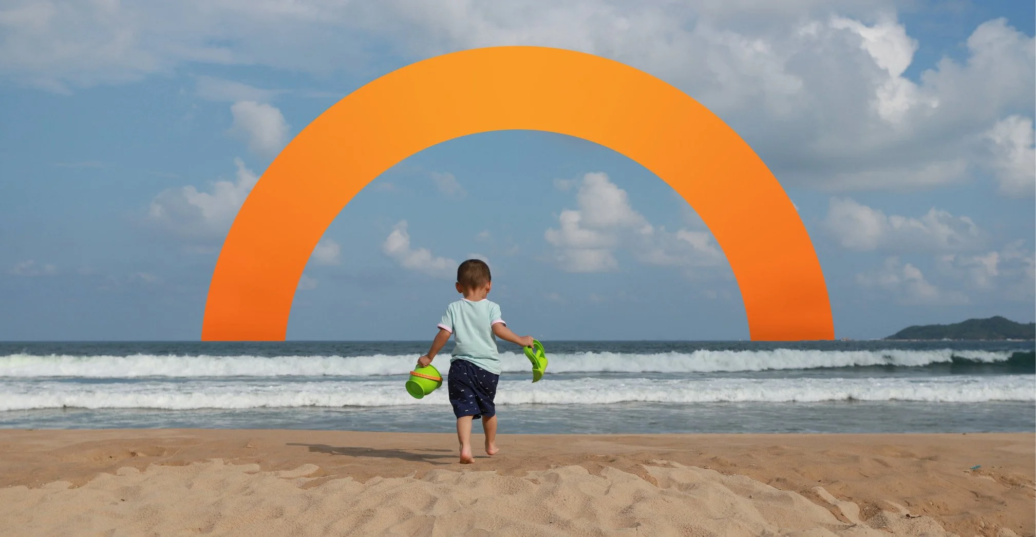
One of the major focus points was improving their focus area pages. The previous layouts felt disconnected, so we created a cohesive template where each area is uniquely highlighted through the color palette. We also layered sections of the new icon over bright, optimistic imagery to bring everything to life. The homepage, focus area pages, and inner pages now all share a unified look.
To make navigating the site a breeze, we also developed a user-friendly mega navigation and a streamlined inner page navigation system. Now, users can easily explore all of the department’s initiatives, resources, and engagement opportunities with just a few clicks.
Brochures + Iconography.
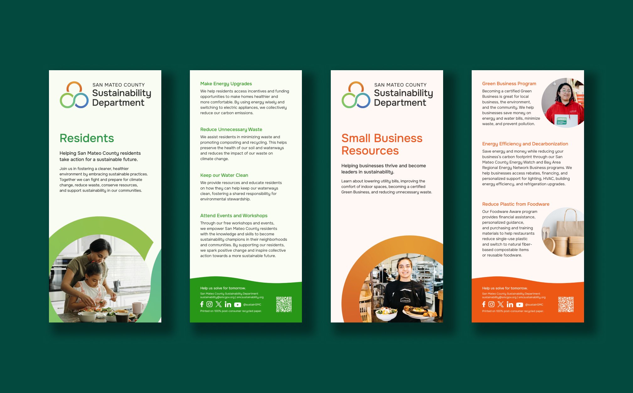
With such a broad scope of work, the Sustainability Department needed four brochures to spread the word about their essential work across the county. The first three targeted Residents, Small Businesses, and Students and Schools, each with a unique color and photography style, all tied together by a cohesive system.
For their main brochure, they wanted to showcase their seven sustainability focus areas. We created custom icons for each one to give people a quick, clear understanding of their work. These simple, clean icons are framed within an open circle to echo the balance and symmetry of the logo, creating a unified look.
Overall, this brand refresh has breathed new life into the Sustainability Department. It’s reinvigorated their team and inspired the work they do every day to create a more sustainable future for the people of San Mateo County.


What we delivered.
-
Brand Identity
Logo
Family of fonts
Color palette
Photography treatment
Identity guidelines
Iconography
-
Brand Experience
Website navigation
Program hero banners
Website page templates
PowerPoint template
Rack cards
-
Campaign
Primary & secondary research
Focus group
Campaign strategy
Campaign messaging
Copywriting
Campaign identity
Communication toolkits
Campaign asset templates
See related work.
-

WRA Environmental Consultants
-

Tipping Point Community
-

Community Action Marin


