WRA ENVIRONMENTAL CONSULTANTS
MAKING A POSITIVE LASTING IMPRESSION.
WRA, Inc. is an environmental consultancy making a net positive impact. They're a tenacious team of planners, engineers, and scientists, leaving the lands we love better than we found them. From wildlands and parks to community spaces, they have a proven track record of making life better for local communities over the past four decades.
When they approached us for their rebrand, we instantly felt how passionate and committed they were to protect sensitive habitats and environments. It was important to us that the brand reflected the down-to-earth nature of its people, promoted them as a socially responsible company, and repositioned them as a leader in its space.


Developing a brand that reflects their ambition to leave the lands better than they found them.
WRA makes sure that where humans and nature intersect, they not only co-exist but thrive. So we developed their tagline, 'Make a positive lasting impression', as a call to action. It speaks to all its audiences, whether employees, partners, or potential clients. It clarifies what they stand for and is at the core of who they are and where they're heading. Building on their positioning and tagline, we got to work on their logo and developed an icon that integrates both a fingerprint and topography. It's a simple and elegant visual that shows how these two elements can live harmoniously, side-by-side.
Their overall look and feel are based on their rugged nature. They roll up their sleeves to do the hard work, sometimes getting mud on their boots and a little dirt under their fingernails. So the earthy tones, textures, and real-life photography keep their identity grounded and real, just like their people. We created a toolbox of curated brand assets, from detailed proposal templates to their company brochure to fun and professional social templates and corporate stationery. The brand is seamless across all applications and, most importantly, easy to use and apply for every team member.
Building a robust website as a strategic tool and recruitment platform to attract the best talent around.
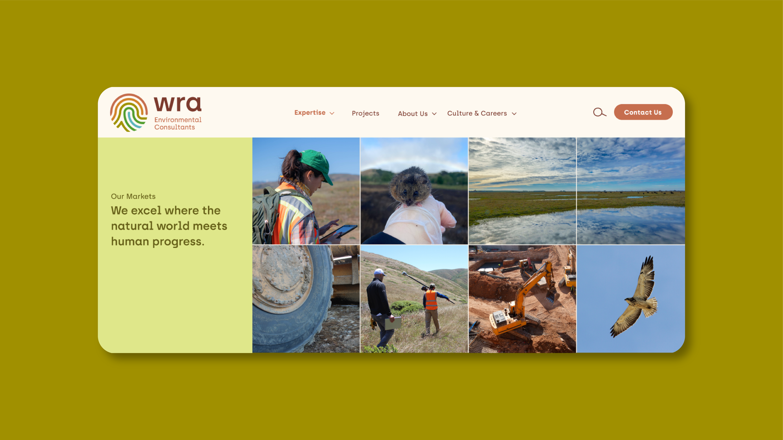
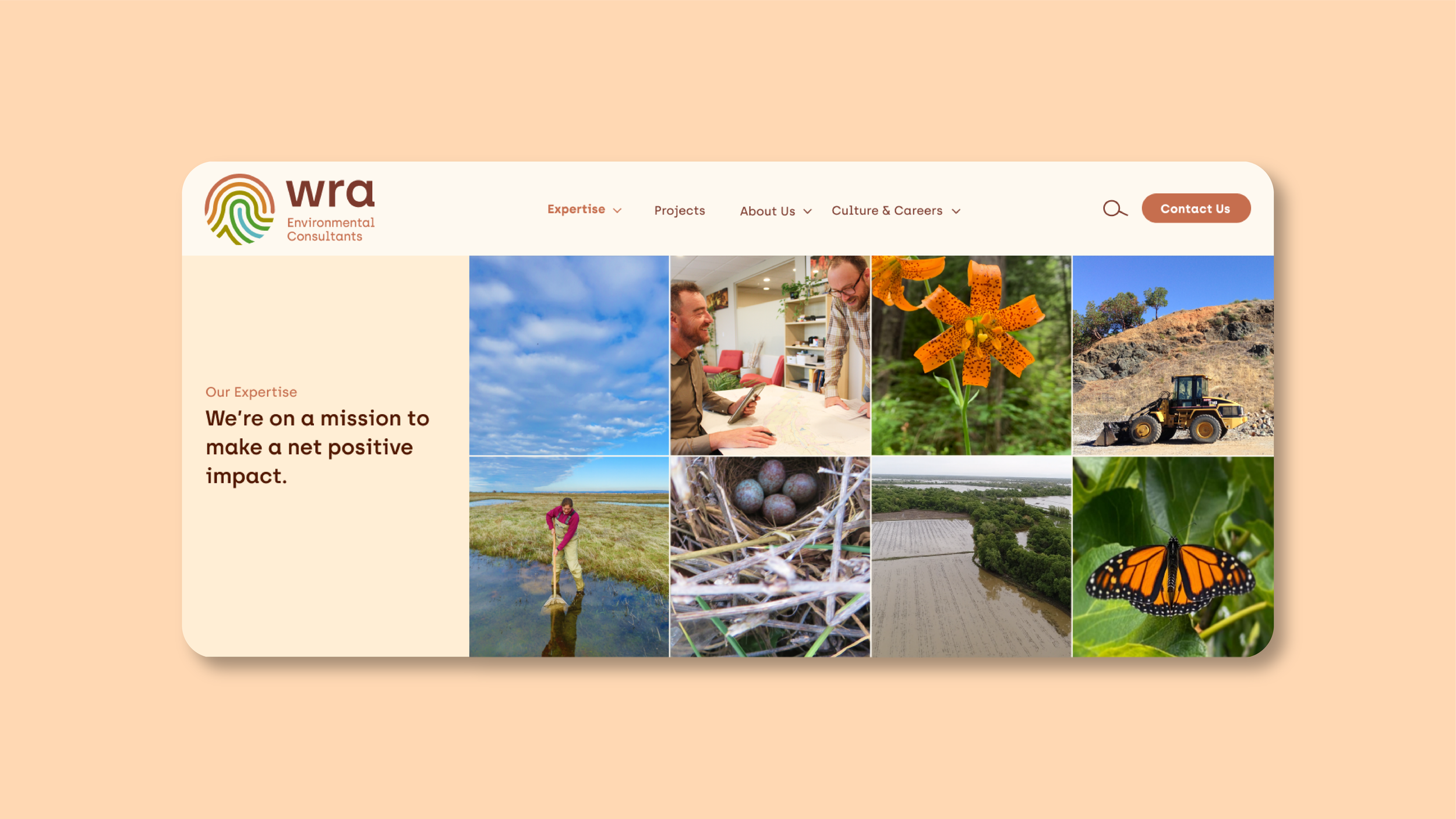
Working side-by-side with our digital strategist and WRA's leadership team, we rebuilt their website from the ground up. With an overload of content, we strategically designed customizable modules and tab systems where the copy is easily digestible and engaging for all audiences. We supported the team in their content process, writing copy for their markets and services to encapsulate a more human and down-to-earth tone of voice.
Along with designing custom modules with a variety of branded color options, we ensured their internal teams' voice and expertise was cross-pollinated across the website, so it came full circle. We used photography grids to show humans and nature together, and an expanded color palette represents different areas of the business, giving structure and focus to their ever-evolving specialties.


“They were just such a fun group of people - so talented in their respective disciplines and creative, but fun! They do great work, but having fun along the way made it so enjoyable. I looked forward to every meeting I had with them.”
— Geoff Smick, CEO, WRA Inc.
WHAT WE DELIVERED.
Website Design
Digital strategy
SEO + tracking
Website design (UX/UI)
Copywriting
Photo assets
Video
Brand Strategy
Research & analysis
Core essence
Vision
Mission
Personality
Tone of voice
Brand + program architecture
Brand Experience
Brand launch campaign
Social media profiles
Newsletters
Keynote
Brochure
Office branding
Workshops + training
Brand Voice & Identity
Elevator pitch
Brand promise
Tagline
Key messages + copy style
Logo
Icon set
Family of fonts
Color palette
Photography style
Brand book


