

Make life work better.
HUMANKIND
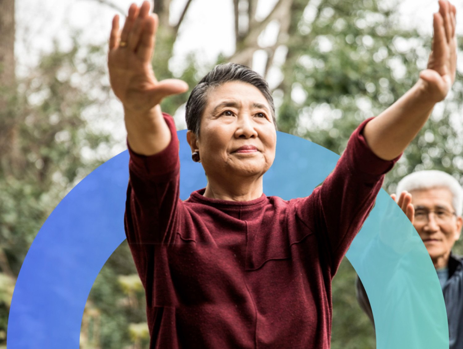
Humankind is a people-first healthcare company focused on transforming workforce quality of life. Formerly AirCare Health, the brand needed to evolve to reflect its bold mission: improving the human condition through proactive, compassionate care. We partnered with the Humankind team to craft a new brand identity—one that reflects both their audacious approach and their deep empathy for the people they serve.


From AirCare to humankind.
The original logo leaned clinical, with cool tones and traditional styling. We reimagined the logo under the new Humankind name, introducing lowercase typography for approachability and a bold punctuation mark: the Hope Icon. The vibrant purple gradient signals warmth, energy, and a break from convention—anchoring the identity in human connection.

An icon to inspire.
The Hope Icon—a semicircle that symbolizes Humankind’s core mission: to bring light where there is darkness. It’s a rising sun, a daily promise of progress. Whether used as a graphic element or integrated into photography, this icon gives the brand a distinct and meaningful visual signature.
A tagline that invites action.
We developed the tagline Make Life Work Better as a call to action and a brand promise. It captures the essence of Humankind’s work—meeting people where they are, offering real support, and creating meaningful change. It’s short, memorable, and scalable across channels.


A website designed to support everyone.
The website redesign brought all elements of the new identity together in a digital space that prioritizes clarity, compassion, and usability. We overhauled the information architecture, wireframed key user flows, and applied accessibility best practices (WCAG AA) to ensure the site reflects Humankind’s inclusive mission. The result is a user-friendly platform that works for every visitor, on every device.


What we delivered.
-
Brand Strategy
Research & analysisCore essence
Differentiators
Personality
Tone of voice
-
Brand Voice & Identity
Elevator pitchBrand promise
Tagline + descriptor
Value propositions
Logo
Color palette
Fonts
Photography style
Iconography
Brand book
-
Website Design
Digital strategyWireframes
Copywriting
User experience/user interface (UX/UI)
Responsive design
Accessibility
Animation
Reporting & Analytics
-
Brand Experience
Brand launch campaignSocial media
Presentations
Event design
Brochure
Business system

Digital advertising

Social media


Visual language built from hope.
To extend the Hope Icon beyond the logo, we created a full icon system built from its semicircle shape. These icons—used across print and digital collaterol—maintain consistent visual language while supporting content navigation, storytelling, and communication at a glance.

See related work.
-

Destigmatizing mental health.
-
Care shaped around you.
-

Developing a brighter future for kids.
