HELP ME GROW MARIN COUNTY
DEVELOPING A BRIGHTER FUTURE FOR KIDS.

The first five years of a child's life are the most critical, and parents and caregivers are getting an overload of essential information. The communities of Marin needed one centralized place to gather information, download helpful tools and connect to local resources. Serving a diverse population, the new site would have to perform many tasks. It needed to be bilingual in English and Spanish, hosting a resource library with downloadable assets and providing tailored information for their three different audiences. Some of these topics can be overwhelming and scary for parents, so the site is designed to feel warm and inviting, putting them at ease.

Modernizing a national logo-mark.
Being a part of a national network meant certain parameters were in place when updating the logo mark. The most significant component we needed to retain was the five petals representing a child's first five years of life. Beyond that, we had free reign to update other parts of the mark. We adjusted the petals Marin County was currently using, making them more consistent and geometrically correct, punching up the colors of the strokes to be more inviting and kid-friendly. Then, we softened the mark with pastel fills, creating an offset look for more visual interest. The typeface we selected for the logo had a much more approachable feel with rounded edges and gave you the feeling of childhood without being childish. We un-nested Marin County from being sandwiched between the other words to create a more legible mark. The result was a more modern take on what they had been using while staying recognizable to other Help Me Grow organizations and setting the tone for new treatments that would be developed for the website.


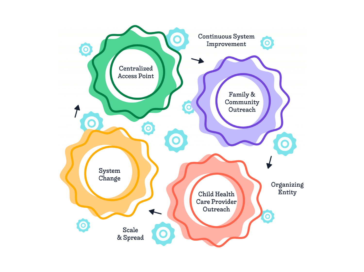
Developing a site built for guidance and resources.
With no existing site to work from, we collaborated closely with the Help Me Grow team to develop the site architecture and user experience. It needed to be easy to navigate and lead people to the resources they're looking for in a stress-free way. The homepage design captured links to all the other high-level pages, educated the user about HMG, and provided helpful resources. We worked with our developers to create a fully translated Spanish site, an interactive filtered resource library, and built-in contact forms. Creating simple icons that could be easily understood and a color code system for each audience was another way we made the site overall more accessible to users despite their native language.


WHY SEO IS NOT YOUR DIGITAL STRATEGY.
Analytics and data fuel our website projects. See how having measurements in place helps you make smarter creative decisions.

What we delivered.
-
Brand Strategy
Research & analysis
Personality
Tone of Voice
Website Architecture
-
Brand Voice
Positioning statement
Descriptor
-
Brand Identity
Logo
Family of fonts
Color palette
Photography style
-
Brand Experience
Website
Social media
See related work.
-
Grand Rounds Health
-

Vibrant
-

YMCA