The evolution of the revolution.
RITUAL COFFEE ROASTERS
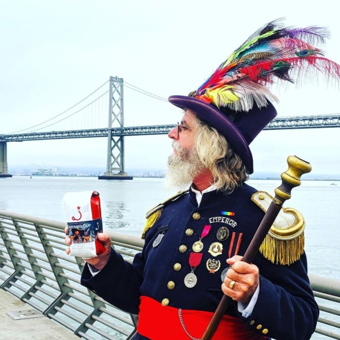
Since we created their iconic brand in 2005, Ritual has become one of the most revered coffee companies in the world. But they were losing market share to younger, less authentic coffee companies and also wanted to combat the snobby stereotype that had become synonymous with 3rd wave coffee. We repositioned them away from their hipster competitors by doubling down on their local roots, making them part of the San Francisco establishment. By communicating stories about their farmer partners, and developing friendly, detailed brew guides, Ritual could share their great love of coffee in a fun and down-to-earth way. They may have started the coffee revolution, but now they're about demystifying the coffee experience.

-

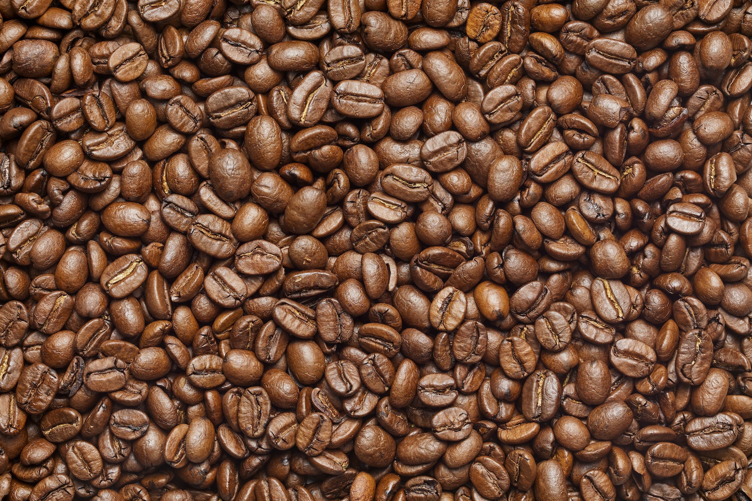
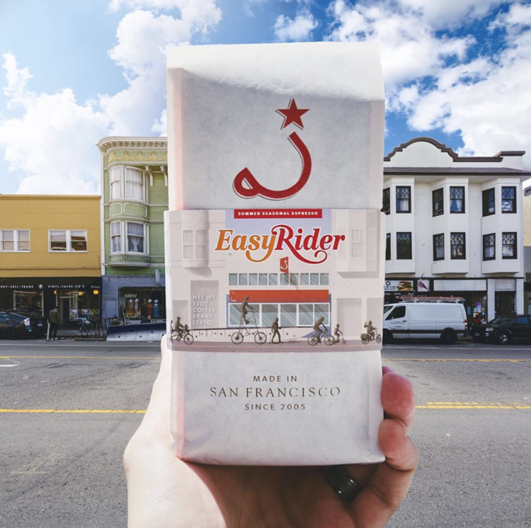
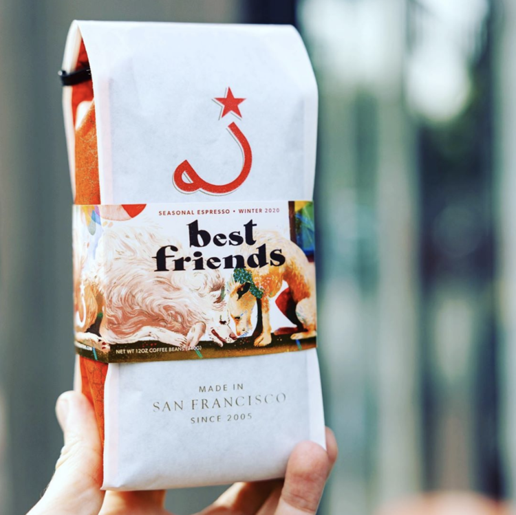
Our award-winning packaging.
-
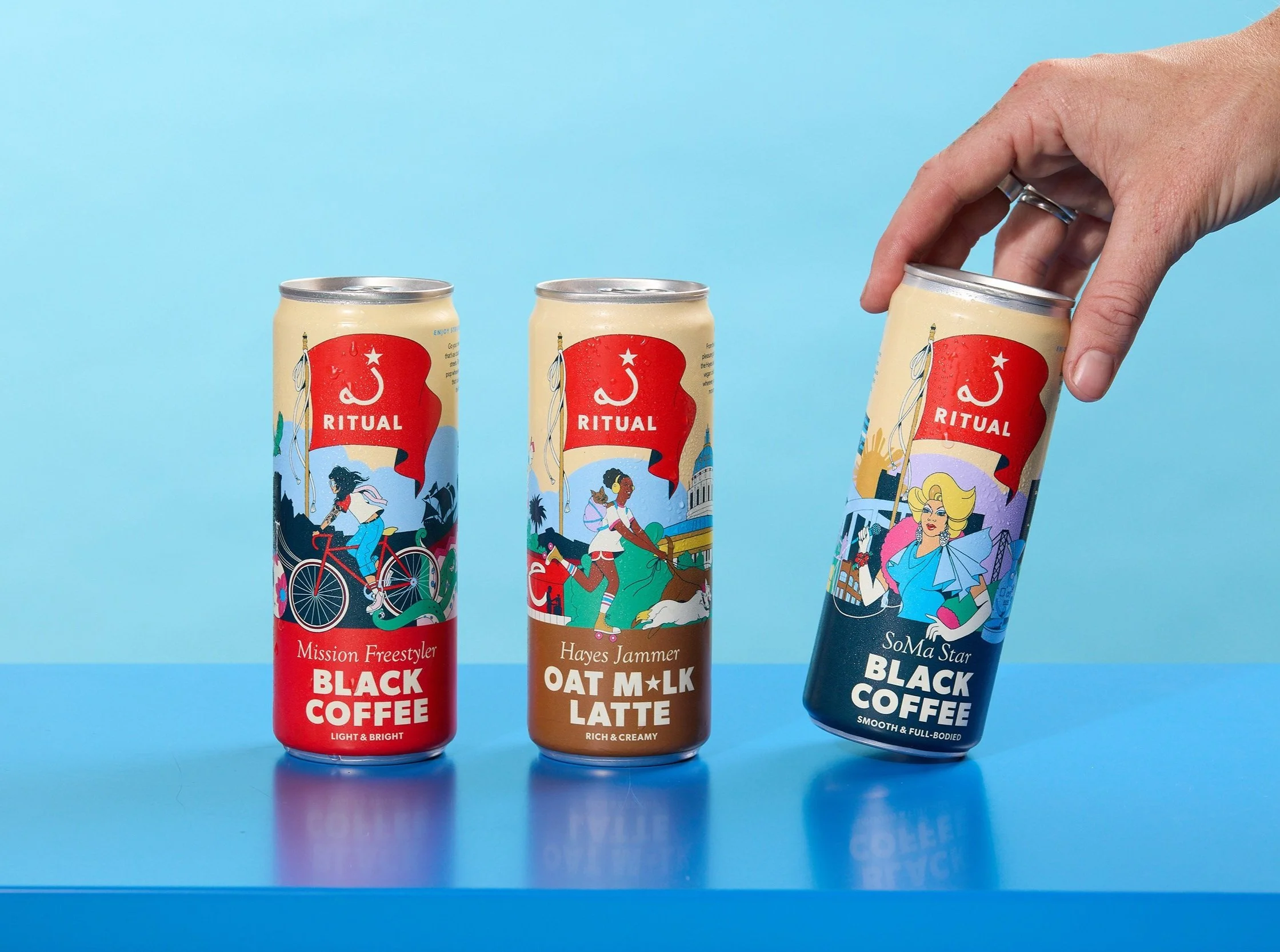
An original ready-to-drink coffee line.


What we delivered.
-
Brand Strategy
Research & analysisVision
Mission
Values & culture
Personality
Tone of voice
-
Brand Voice
Positioning statementElevator pitch
Brand promise
Tagline
Copywriting
Product architecture
-
Brand Identity
Logo & iconFamily of fonts
Color palette
Copy style
Photography style
Illustration style
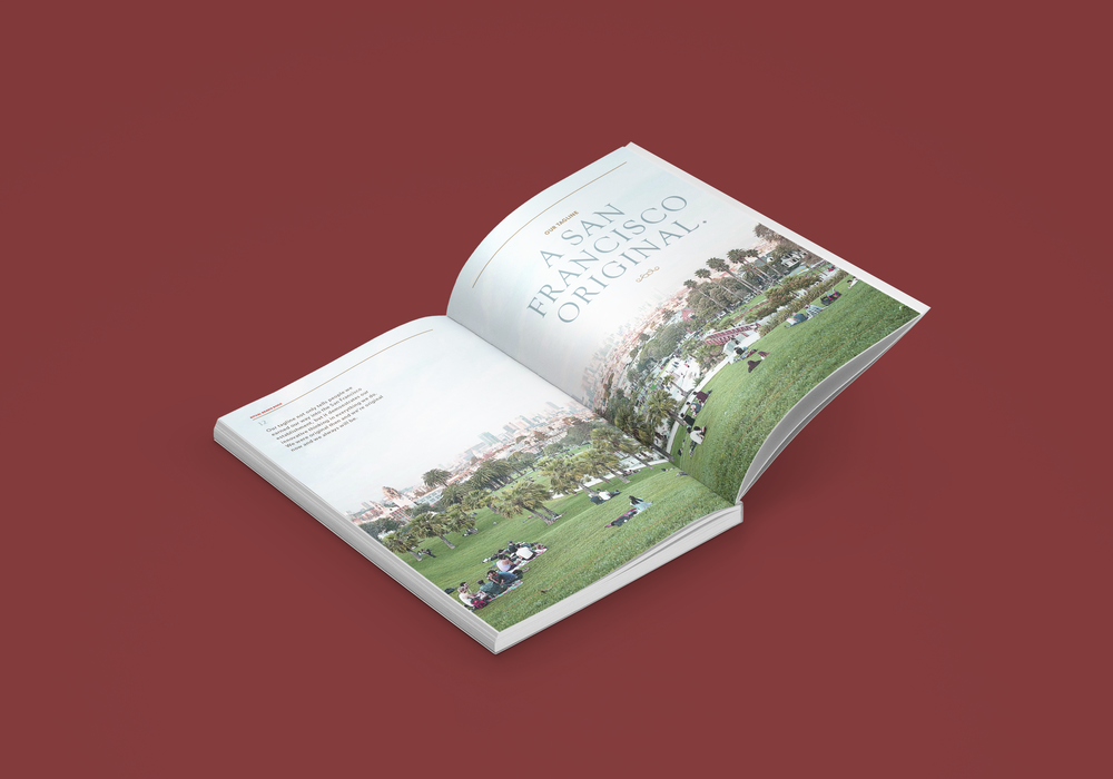
Brand book
-
Brand Experience
Brand launch campaignPackaging design
Communication strategy
Environmental graphics
Retail branding
Promotional materials
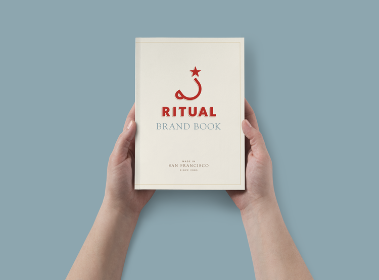
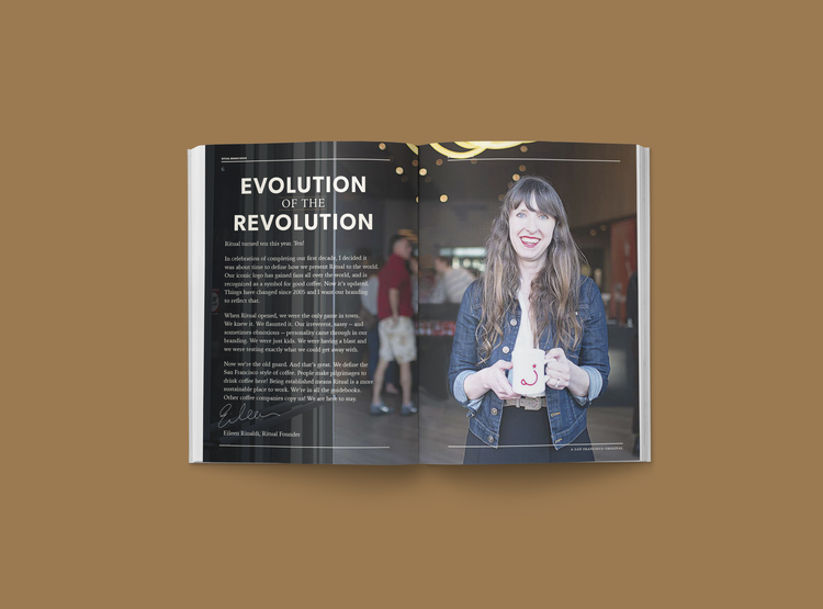


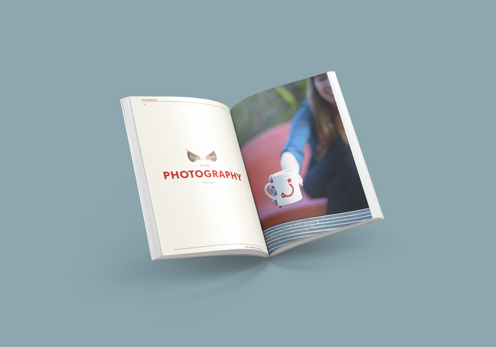

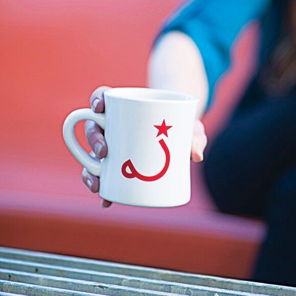
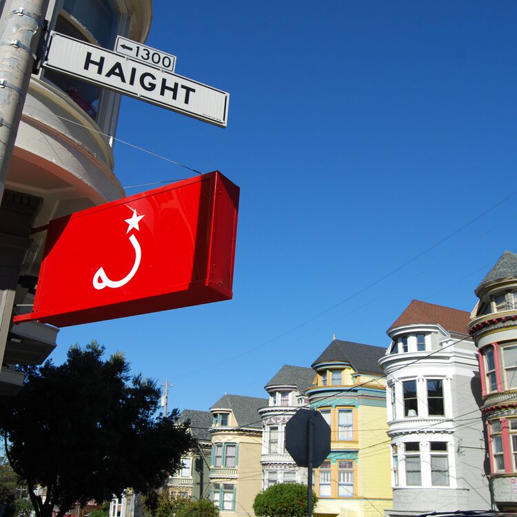
"What is the meaning behind our logo?
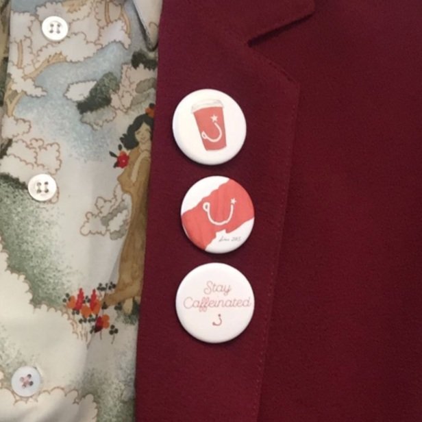
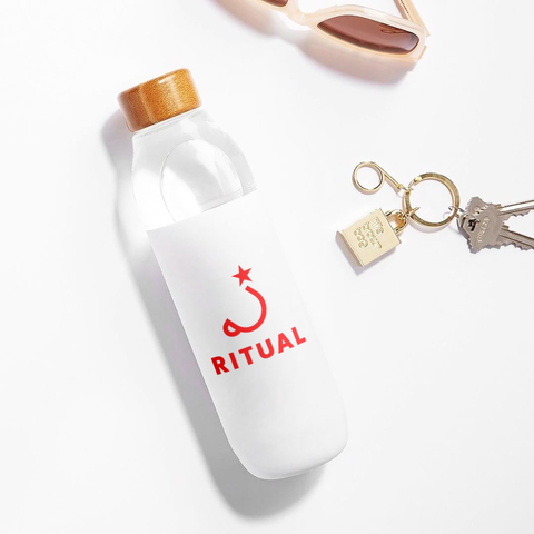
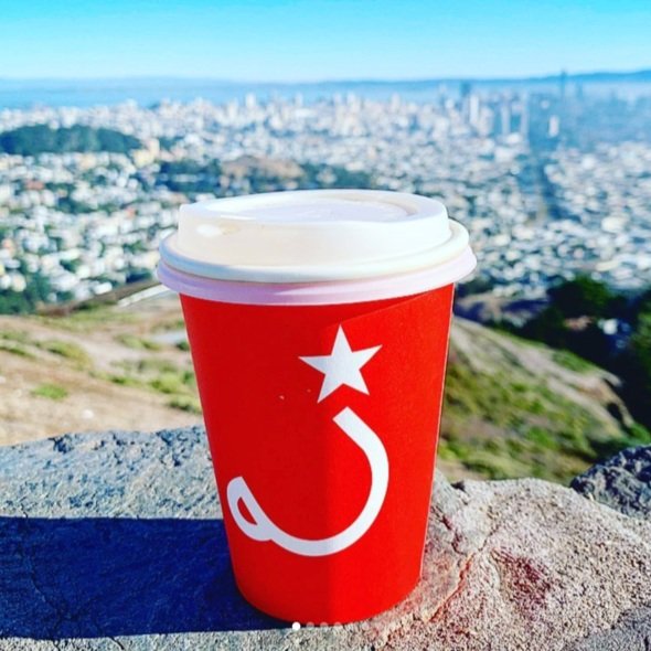
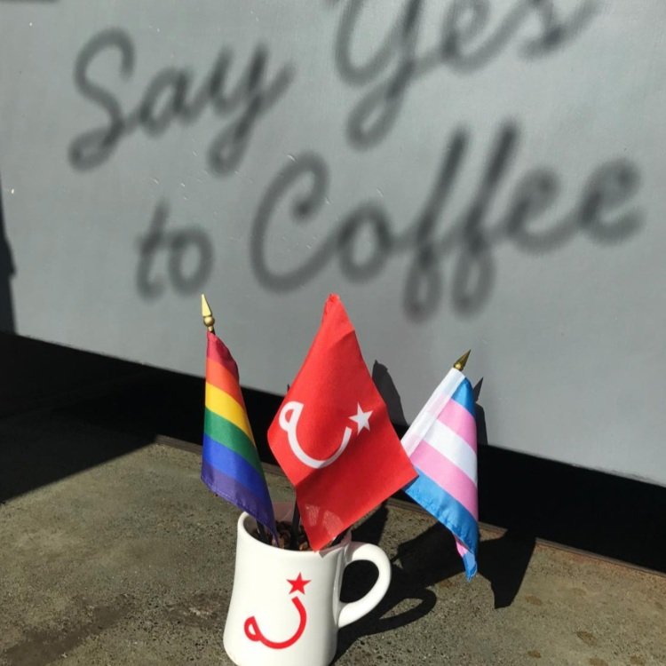
Ah, our iconic cup and star! This was designed based on the vision that what we were doing was really revolutionary and that we needed an instantly recognizable symbol, perhaps even a flag. Aimee Kilmer of Good Stuff Partners came up with the cup and star, inspired by both the bold color contrasts of the Turkish flag and the iconography of the Soviet era. People still ask us if we’re communists sometimes. We are not."
— Eileen Rinaldi - Founder Ritual Coffee
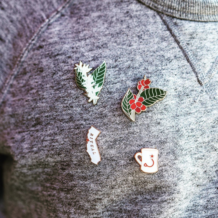




MORE BUZZ
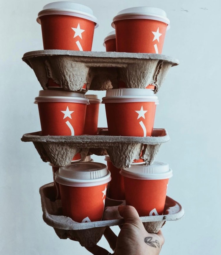
Ritual's packaging wins Communication Arts design award.
Ritual packaging featured on the Dieline.
Ritual packaging video and review on Unpacking Coffee
Aimee Kilmer’s interview for Coffee, Tea & Ice Cream Magazine
See related work.
-

Houston's first indoor hydroponic farm.
-

Conscious goods for a peaceful home & garden.
-

America's first vegan dog food company.
